I found a fascinating essay archived on cancerguide.org by evolutionary biologist Stephen Jay Gould entitled, "The Median Isn't The Message." It's a story about how cold, stark cancer statistics became intensely personal after Gould was diagnosed with a rare form of cancer in 1982.
Having spent years myself as a data jockey in the healthcare system, including in a cancer agency, I am familiar with those cold statistics. I had many of them memorized for easy retrieval. Whenever I heard about an acquaintance who had been diagnosed with cancer, I would immediately determine in my head the likelihood of treatment success. It was not the kind of information that was particularly helpful to the patient, and I quickly learned to keep that information inside my head!
Gould's cancer had a median survival of 8 months from diagnosis -- not very good odds at all. Half of these cancer patients survived LESS than 8 months! Being a biologist familiar with statistics, he forced himself away from the reflex conclusion that he had about 8 months to live. The important information was the shape of the survival distribution curve, not in the median value.
As with most healthcare distributions, cancer survival is an exponential curve with a long tail to the right, meaning a few people survive much longer than the median. The second consideration was to determine what factors classified those patients into subgroups within that distribution. Age was one, and since Gould was relatively young, his odds at beating the median survival were better than average.
In Gould's case, a new experimental treatment turned out to separate him from the rest of the distribution and he survived for another 20 years. When he died in 2002, it was from an apparently unrelated form of cancer.
The main point of the article is to always understand your data before you draw conclusions from it, and the best way to understand data is to look at it visually. I always told my analysts to start with a graph of the dataset and then focus the analysis on the interesting parts. Simply starting with averages, medians, minimums, maximums, and even fancy statistical measures like correlation coefficients will not tell you enough.
That's where Business Intelligence and Data Mining tools really make life easy. Visualizing the data will convey much more useful information than a table of statistics. In BI, a picture is definitely worth a thousand words!
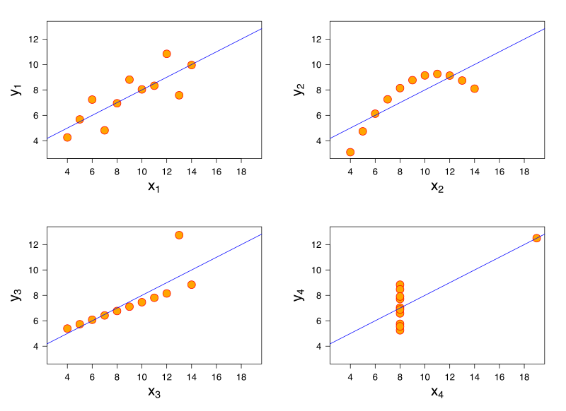
Statistician Francis Anscombe demonstrated this principle elegantly in 1973 by creating four datasets with very different distribution shapes, but almost identical statistical properties. They are known as Anscombe's Quartet.

The datasets all have the same average values for x, same average values for y, and the same variances for each. In a normal or bell curve distribution, you can think of the variance as a measure of the width of the bell. In a cluster of data points, variance can be understood as average minimum distance from the best-fit line running through them. The Anscombe datasets also have the same linear regression result (i.e. the best-fit line through the data points) and the same correlation values. Correlation is a measure of how much the x- and y-values move together. A high positive correlation means that when x increases, so does y.
In Anscombe's Quartet, the first dataset is a textbook example of how these statistical functions are supposed to work. The variance, regression line, and correlation are all accurate descriptions of the behaviour of this group of data points.
However, the third dataset is skewed by a single outlier. The slope of the regression line is off, and the correlation should be a perfect 1 if the outlier is excluded. Graphing the data makes outliers very obvious. Sometimes outliers are measurement errors and should be excluded, but if there are many outliers it suggests there are two different datasets being displayed together.
The second dataset shows the bias of incomplete measurement. The data is clearly curving, so a linear regression is arbitrary in that it would differ greatly if we made one more measurement, and it would differ again if we made two more measurements. The x- and y-values are related to each other, but in a completely non-linear way. Regression should not be considered in this case as it is meaningless.
The fourth dataset shows a completely uncorrelated, non-linear dataset with a single outlier, yet the statistical measures still generate the same results as the first dataset suggesting a high degree of correlation and linearity. This is a stellar example of how statistical measures can be completely erroneous if used blindly.
The Anscombe Quartet highlights the frailty of some statistical measures when you leave the realm of linear or normal distributions. Bell curves are nice, but they don't exist everywhere in the real world. If you assume bell curves or linear relationships without verifying them first, your analytical conclusions will be way off base.
No comments:
Post a Comment