Showing posts with label statistics. Show all posts

Tuesday, 26 March 2013

Exponential Distributions, Part 4 - Manage to the Mean, Not the Mode

In Part 3 we looked at the forgetfulness of exponential queues, namely the memoryless property.  In this last article, we look at how to manage queues and systems that behave according to an exponential distribution.

Exponential Attribute #4 - The Mean is More Important Than the Mode

Or, Your Gut Feeling Will Fail You


In a normal distribution (bell curve), the peak value coincides with the mean value.  The most common occurrence (the mode) also happens to be the average.

Not so with the exponential distribution.  The asymmetrical tail skews the average away from the peak.  The mean will always be larger than the mode.

So what?  It turns out this subtle mathematical difference can play tricks on your mind if you're not careful.  If you're a manager, that translates into consistently being over-budget and consistently failing to meet your operational performance targets.

Managing to the Mode or to the Mean?

As a manager, you gradually get a feel for how your department operates.  You have a sense of the typical system behaviour, whether it's how long a call on your help desk lasts or how much it will cost to reprogram 100 lines of code.  There is randomness involved, but your experience tells you the randomness averages out over time.  If your system behaves according to a normal distribution, then it's hard to know if you're managing to the mode or to the mean.  In fact, it doesn't matter because the two values are the same.

However, if your system behaves according to an exponential distribution, it suddenly matters which value you are managing to.  When you want to manage to achieve the budget targets, you must use the mean.  The mode is irrelevant.

I have found that people tend to manage to the most common events.  It is easy to get a "gut feel" for the things that happen the most frequently, but it is not as easy to get a "gut feel" for the average.  That means your "gut" manages to the mode.

Therefore if you manage according to your gut, an exponential system will cause you to fail every time.  If you budget to the mode, you will always end the year over budget.  If your target time for callers kept on hold is set by the mode, you will never achieve your target.  You must budget and manage to the mean.

Beware of Management CFIT

In aviation, investigators created a term called CFIT, which means Controlled Flight Into Terrain.  It can be the cause of a crash when the aircraft is working fine, including the instruments, but the pilot ignores the signs and flies by "gut feel" instead.  When visibility is poor, that means the pilot can fly the plane directly into the ground, sea, or mountain without realizing it.

When you are managing a system that behaves in an exponential way, you must fly by instruments and not by your gut.  Your instruments tell the nurse manager that the average stay of her inpatients is 5 days, but her gut feel is that 3 days is more common.  Her gut is right (i.e. the mode length of stay is 3 days) but she must manage to the mean of 5 days to stay on budget.

That is why reliable and frequent reporting is key to managing exponential systems, because without reliable instruments you cannot pilot the system properly.

Manage to the Mean AND Build Flexibility

Managing to the mean is still not enough to be a successful manager however.  As discussed in Part 2, with exponential distributions the tail wags the dog.  You must be prepared for the large but rare outlier events that will have a huge impact on your system, such as the spinal injury patient whose length of stay is greater than 1 year.  Over the long term the average value will become correct, but during a single budget year there may not be enough time to absorb the effect of such a large-valued event.  To handle those events, you need to build in some flexibility into the system.

Flexibility can take different forms.  It can involve cross-training of staff to permit additional capacity when a long-duration event occurs.  For instance, asking a mortgage specialist to cover as a bank teller when one customer has an hour's worth of coins to deposit or having an extra doctor on call when the Emergency waiting time exceeds a few hours.  It can also take the form of budget reserves.  For instance, the cost of that rare spinal injury patient cannot be predicted by simply budgeting to that nursing unit's averages, but across a hospital with a few dozen nursing units, those rare outlier events may happen with much more predictability.  (This is the Central Limit Theorem in action.)  A once-in-a-half-century event for a nursing unit may become a bi-annual event across the entire hospital, which becomes much easier to budget for.  When an unusual event occurs, transfer that reserve to the affected nursing unit and the departmental budgets stay on track.  You have managed to predict an unpredictable event and reduced it's impact on your system.

Summary

What I hope to have shown in these few articles is that exponential distributions are real, they have some counter-intuitive effects, but they are actually quite predictable and manageable if you understand their behaviour.


Monday, 18 March 2013

Exponential Distributions, Part 3 - Queues Just Don't Remember

In Part 1 and Part 2, we have looked at some characteristics of exponential distributions, particularly the Erlang distributions.  In this article we tackle another attribute of an exponential queue.

Exponential Attribute #3 - The Memoryless Property

Or, Always Press the Reset Button When You Arrive

Queues are just line-ups, so how can a queue possess a memory?  
As it turns out, some queues and systems do have a memory, but not all.  It is actually quite intuitive that all queues should have a memory.  We expect that what happened before you got in line should affect what happens after you arrive.  However, queues that are memoryless are not affected by what happened before you arrive.  That behaviour is counter-intuitive, at least at first glance.


What is a "Memoryless" Queue?

A memoryless queue refers to the property that what happened before you arrived in the queue will have no affect on the timing of the next event after you arrive.  Why does this matter?

Let's create a fictional example of waiting for a taxi cab to pass by on a street corner to take you to your next meeting.  You arrive at a random time and taxis are passing that corner at random intervals.  How long will you expect to wait for the next taxi on average?

If some data is collected at that corner over a period of days, let's assume the data shows the taxi intervals follow a normal distribution (bell curve) with an average interval of 5 minutes.  When you arrive on the corner, sometimes you will have just missed a taxi and would expect to wait a full 5 minutes for the next one.  At other times, you might arrive 5 minutes after the last taxi and would expect to wait a very short time for the next one.  On average therefore, you would expect to wait 1/2 of the average interval time, or 2.5 minutes.  Further, if there was a hotdog vendor on that corner who paid more attention to taxis than to his customers, you could ask him how long ago the last taxi passed.  If it was 5 minutes ago, then you would expect to wait only a short time, whereas if the last taxi passed seconds ago, you would expect to wait about 5 minutes.  In other words, the memory of the previous event in the system affects your expected wait time.  That is intuitive.

However, now assume the data instead showed that taxi intervals on that corner follow an Erlang distribution with an average interval of 5 minutes.  How long would you expect to wait for a taxi now?  It turns out the correct answer is 5 minutes -- not half the average interval, but the average interval itself.  Further, it doesn't matter what the hotdog vendor tells you about the last taxi to pass by.  Whether it was 5 seconds ago or 10 minutes ago, the expected average wait time for you will be 5 minutes from when you arrive.  It is like the queue has no memory -- it doesn't matter what happened before you arrived, the expected wait time clock resets itself.  How could this be?  Surely it cannot be true.  It appears counter-intuitive.

The easiest way to demonstrate this is with a non-queue example.  Imagine a factory that manufactures pipe. One machine extrudes pipe continuously and an automated saw immediately cuts the pipe into either 1 meter or 9 meter lengths, depending on the next customer order in the computer system.  Effectively the order of pipe lengths is random, but on average the machine produces 50% short pieces and 50% long pieces each shift.  The pipe continues moving along the assembly line at a constant speed where a robotic arm randomly selects pieces of pipe for quality control testing.  An arm shoots out and knocks the pipe that happens to be passing by at that moment into a bin.  The arm is programmed to randomly activate a certain number of times per shift.

At the end of each shift, what proportion of long and short pieces of pipe would you expect to find in the bin?  Even though that machine produces half short and half long pipes, that will not be the composition in the bin.  Because the long pieces of pipe take 9 times longer to pass the robotic arm, the odds are 9 times greater that a long piece will be selected.  Therefore you would expect 90% of the pipes in the bin to be long ones.

It is the same principle with memoryless queues.  Even though a long interval between taxi cabs is rare, the odds are greater that you will happen to arrive while one of those long intervals is occurring.  That increases the expected wait time, and it turns out to increase it exactly to the mean value.  Even if that last taxi came 8 minutes ago, you can still expect to wait 5 more minutes.  You could just be in one of those rare but long duration intervals.

And that is what it means for a queue to be memoryless.  Whatever happened before you arrived is irrelevant -- the clock resets when you get there.

Friday, 8 March 2013

Exponential Distributions, Part 2 - The Tail Wags the Dog

In Part 1, we looked at the asymmetry of exponential distributions, particularly Erlang Distributions.  We concluded that in terms of randomness, bad luck will come more frequently than good luck.  Now in Part 2, we look at the magnitude of that bad luck.  It's not just about the number of bad luck events, but how large those individual events can be and how much effect they can have on the behaviour of a system.

Exponential Attribute #2:  Outliers Cannot Be Ignored
Or, The Tail Wags the Dog


What is an outlier?

An outlier is a statistical term for an observation that is markedly different from the other observations in the dataset.  It is ultimately a subjective definition even though they are often determined using statistical formulas.  Common practice uses +/- 3 standard deviations from the mean as the boundary for outliers, which is reasonable for normal distributions.  However, there is no mathematical rule that says this boundary definition is better than any other.

So what is the purpose of identifying outliers?

The primary purpose is to exclude measurement errors or other unusual occurrences that would bias the dataset and lead one to make a wrong conclusion.  That's a worthwhile goal.  However, the opposite danger is to exclude valid measurements as outliers and that too can lead one to make a wrong conclusion.  Excluding outliers is a double-edged sword.

The chart on the right is a box plot of the Michelson-Morley Experiment results from 1887 where the speed of light was measured as the earth moved through the supposed "aether wind" of space.  There were 5 experiments with 20 observations each.  The top line of each box shows the 75th percentile value, the bottom line is the 25th percentile, the middle bold line is the median, and the T's are the maximum and minimum.  The small circles represent outliers as per the boundary definition above.  For experiment #3, four of the observations are deemed to be outliers -- two large-value outliers and two small-value outliers.  As you can see, while statistically they may be considered distant from the rest of the values in their group, three of them are within the normal "inlier" ranges of the other four experiments.

This is a good example of the difficulty and arbitrary nature of defining an outlier.  When you realize that ALL of the variation in this experiment is solely due to measurement error -- the speed of light is not changing -- then it raises the question as to why some measurement errors would be accepted as inliers and other errors would be deemed outliers.  How does one know if the two low-value outliers in experiment #3 are closer to the true value than the other 18 higher values?  As it turns out, the true speed of light is at value 792 in this chart (792 + 299,000 km/s).  That means one of the low-value outliers in Experiment #3 is just as close to being correct as the 25th percentile value.  It was a valid measurement and should not be classified as an outlier.

So even though this dataset was roughly normally distributed, it was still difficult to find the true outliers.  With exponential distributions, it gets even more difficult because of the long tail.  Simply going out 3 standard deviations from the mean does not give you a reasonable boundary for identifying outliers.

For example, using an outlier boundary of +/- 3 standard deviations on a normal distribution would define 0.27% of the events to be outliers, or 1 out of every 370 events.  That means if you were measuring the outdoor temperature once per day, you would expect to see either a high or low outlier about once per year.  If however the temperature happens to follow an Erlang distribution (with k=3, lambda=6), you would define 1.2% of the events to be outliers using the 3 standard deviation rule.  That means you would expect to see an outlier temperature once per quarter.  That's not particularly infrequent.  (Yes I know temperature doesn't follow an Erlang distribution, but humour me for a minute!)  Erlang distributions do not have the heaviest tails either -- other distributions such as the Log-normal or Weibull can have much heavier tails and therefore much greater proportions of their events beyond the 3-sigma boundary.

It's not just the number of outliers that's important to understand, but the size of each outlier as well.  The heavier the tail, the higher the outlier value can be.  In a normal distribution, the rare outlier events will still have values fairly close to the outlier boundary.  In fact, an outlier greater than +/- 6 standard deviations from the mean essentially never occurs in a normal distribution.  Not so with exponential functions.  The tails go on and on, and some outliers can have absolutely huge values.  Using our Erlang function parameters above, we would expect 0.016% of outliers to fall beyond 6 standard deviations above the mean, or 16 of every 100,000 events.  That's not frequent, but it's a far cry from never!  To use our weather analogy one last time (I promise!), that's an incredibly extreme temperature once every 17 years.  Or it's like a "storm of the century" that happens 5 or 6 times a century.

What's important to understand is that these very large and rare events are not outliers.  They are valid, real events that are an inherent characteristic of these exponential distributions.  They are not measurement errors or aberrations from what is expected.  They should not be dismissed but rather expected and planned for.

An Economist Discovers the Exponential World of Healthcare

I saw this play out in stark reality on a project a number of years ago.  I was part of a team doing data projections showing how the retiring baby boomers would affect the provincial healthcare system over 25 years.  One analysis involved predicting the demand for inpatient services.  A semi-retired and respected economics statistician on our team built a spreadsheet model for inpatient demand, crunched the numbers, and declared that inpatient days would go down over the coming decades as the baby boomers retired, and that the total inpatient costs would also drop.  The team leader was thrilled with the good news, but I was skeptical.  I had read a couple studies in peer reviewed journals that made the exact opposite conclusion, namely inpatient days would rise, average length of stay would rise, and costs would increase materially.

I asked the statistician for his model and data to review his analysis.  The data was fine and his model was sound, except for one minor step -- he ignored all of the data points above 3 standard deviations from the mean.  I asked him his reason for this omission of a significant portion of the dataset and his reply was, "Well, that's what I always do."  Obviously his entire career was spent using macro-economic data that was normally distributed, and he got into the habit of eliminating the outliers for every analysis without even thinking about it.  The problem was that one cannot do that with inpatient length-of-stay data, which follows an Erlang distribution.  This economist had used his "outlier magic wand" and made the sickest patients in the province instantly disappear!  And what do you know?  Hospital costs go down when you make the sickest patients disappear!  Unfortunately doctors and hospital administrators don't have that magic wand in their pockets and they know the sickest patients have to be treated, often at significant cost to the system.  Eliminating them from the projection made no sense.

I redid the analysis using all of the inpatient data and it agreed with the published studies, namely that inpatient days, average length-of-stay, and costs would all rise as baby boomers retired.  It took a lot of convincing of the team leader that my analysis was identical to the economist's analysis, except that I included the sick people!


When dealing with exponential distributions in the real world, remember that the tail end of the distribution drives the behaviour of the system.  Do not ignore the outliers.  They are likely real events, they will happen more frequently than you would like, they will be larger than you like, and if you ignore them you will get the wrong answer.

With exponential distributions, the tail wags the dog.

Postscript

After publishing my article this morning, I found an article by Carl Richards at Motley Fool who argues that outliers in normal distributions shouldn't be ignored either.  Seems to be the theme for the week!


Thursday, 7 March 2013

Exponential Distributions, Part 1 - Expect More Bad Luck Than Good

In a recent blog post, I discussed how JPMorgan got burned by assuming derivatives behaved according to a normal distribution when in fact they followed an exponential distribution.  I want to delve a bit further into some of the counter-intuitive aspects of exponential distributions because I have found most people are not familiar with them.

Randomness

First it is important to understand that all of these distributions I am referring to deal with randomness.  When the next event cannot be predicted precisely, such as tomorrow's stock market close or the roll of the dice, it is an example of randomness.  However, if a population of related random events is studied as a group, the randomness will take on a particular form.  The histogram for rolling a single die will be flat, with each value from 1 through 6 having an equal 1/6th chance of occurring.  Sometimes those histograms take the shape of a bell curve (normal distribution) or an exponential distribution or something completely different.  It just happens that normal and exponential curves appear a lot in the real world.

Erlang Distributions, shown to the right, are just one family out of many exponential curves.  The mathematics of Erlang functions can be viewed here, but it's not necessary to know the math in order to understand their behaviour.  Most queues in the real world follow an Erlang curve (think the line-up at the bank or how long you will be kept on hold by your company's help desk).  Exponential distributions come in many shapes and sizes, but they share some common attributes that differ significantly from the Normal Distribution.  These mathematical differences create real-world consequences that must be understood in order to manage them appropriately.

Exponential Attribute #1:  Assemetry
Or Expect More Bad Luck Than Good


Normal distributions are symmetrical about their mean, which implies random variation will occur equally above and below the average value.  If you equate randomness with luck, and one side of the mean as good and the other as bad, then you will get approximately equal amounts of good luck (above the mean) and bad luck (below the mean).

Exponential distributions however are lop-sided.  This is because there is a minimum value but no practical maximum, and because the mean is relatively close to the minimum.  For example, inpatient length of stay in a hospital cannot be less than 1 day but it can extend out to hundreds of days on rare occasions.  The duration of a telephone call cannot be less than zero seconds but it can extend into hours or even days if it is a computer modem that's making the call.

How is this important?  

It means unusual random events will almost ALWAYS be on the long side of the distribution.  You will not get enough randomly small events to balance out the randomly large events as you would expect in a normal distribution.  For instance, if shoe size in a population happens to follow a normal distribution, we would expect to find an unusually large set of feet (i.e. more than 3 sigma above the mean) on a rare occasion (about 1 out of every 370 people).  Similarly we would also expect to find an unusually small set of feet (i.e. less than 3 sigma below the mean) on an equally rare occasion.  If our sample size of the population is sufficient, those large and small outliers would balance each other out and our mean value would be unaffected.  Not so with exponential outliers.  When you get an inpatient who stays in a hospital ICU bed for 2 years (such as a spinal injury from a diving accident) you will never get an inpatient who stays -2 years to balance things out.    That one outlier event will significantly impact the average length of stay for that ICU and probably for the entire hospital.

Therefore, exponential distributions bring unbalanced randomness.  Warren Buffet found this to be true of the insurance industry, as he states in his 2005 Letter to Shareholders:
"One thing, though, we have learned – the hard way – after many years in the business: Surprises in insurance are far from symmetrical. You are lucky if you get one that is pleasant for every ten that go the other way."

JP Morgan learned this as well.  Days where derivative contracts lost big money were not balanced out by days where those same contracts earned big money.  The random behaviour of that system was severely unbalanced.  The bad luck exceeded the good luck.

Except it wasn't luck.  It was predictable randomness.

If your system's randomness follows an exponential curve, then you must plan for more bad luck than good.


In Part 2 we will look at another implication of this asymmetry, namely the large tail of an exponential distribution.

Monday, 28 January 2013

JPMorgan Learns About Exponential Distributions The Hard Way

Most people are familiar with the normal distribution, more commonly known as the bell curve and technically known as the Gaussian distribution.  Anyone who has had a teacher who marks on the bell curve is familiar with the concept.  It is a histogram in the shape of a bell, with most of the values near the mean and with equal portions on either side of the it, diminishing as you get further from the mean.

However, it seems the smartest minds on Wall Street assumed EVERYTHING in the world of finance follows the bell curve.  BIG mistake!  As it turns out, for JPMorgan it was a $6.2 billion big mistake.  Ooops.  You can read about their mistake here on Slate.com.  First, let me explain a few of the concepts involved and then we'll come back to J. P. Morgan's incredibly wrong assumption.

What is a Bell Curve?

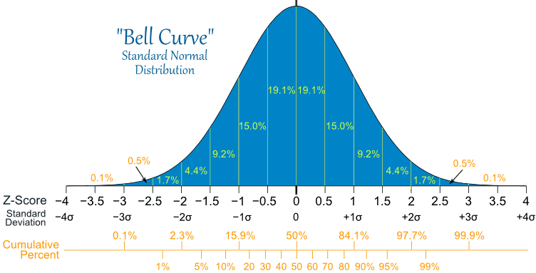
The bell curve below is from mathisfun.com.  It shows that within 3 standard deviations (+/- 3 sigma) of the mean of a normal distribution, you will find 99.7% of the observations.  In other words, there just aren't a lot of events that occur very far from the mean.  The process improvement method Six Sigma takes its name from this concept that if you go out +/- six standard deviations from the mean, you should effectively never get any events occurring outside of this range.  That is only true of course if the variations in the manufacturing process follow a normal distribution, which fortunately is usually true.


The bell curve accurately describes variations in student marks and student heights, many manufacturing processes, and even the daily movements in the stock market, but it doesn't apply to everything we find in the real world.  For example, simple everyday events such as wait times at your grocery store checkout or bank teller, hospital inpatient length of stay, and the duration of telephone calls do not follow a bell curve.  These events follow an exponential distribution.

What Is An Exponential Distribution?


Exponential distributions are asymmetrical (i.e. skewed to one side of the mean), limited on one side by a minimum (usually zero), and have long tails.  In other words, events far from the mean can and do happen with much more frequency than in normal distributions.

My graph on the left shows one type of exponential family of curves called the Erlang Distributions, named after a Danish telephone engineer A. K. Erlang who began using them in the early 1900's.  These in turn are part of a larger family of exponential functions that engineers call Gamma Functions.

What Erlang discovered is that duration of telephone calls did not follow a normal distribution.  You could not have a call of zero duration or less (i.e. a minimum), but you could have an occasional telephone call that lasted hours (i.e. no practical maximum).  Erlang's job was to accurately predict how much switchboard capacity was required, which he ultimately succeeded in doing.

Because of these occasional large-value events, the rules of normal distributions do not apply.  For instance, you cannot presume that 99.7% of your events will fall within 3 sigma of the mean.  Depending on the specific shape of the exponential distribution, a measurable and significant portion of the events will fall far past 3 standard deviations from the mean, and Erlang had to take those events into account when planning his capacity.

JPMorgan's Mistake

As stated in the article, JPMorgan got into the business of complex credit swaps and assumed they would behave according to a normal distribution.

"Credit default swaps simply don’t behave in line with the normal, or Gaussian, distribution typically assumed. The so-called tail risks, or the chances of extreme events, are bigger than that theory predicts. Ina Drew, who ran the CIO, referred to one day’s mark-to-market losses as an eight standard deviation event, according to the report. That translates mathematically into something that should only happen once every several trillion years. It makes no more sense than Goldman Sachs finance chief David Viniar’s famous remark as the crisis unfolded in 2007 about seeing 25 standard deviation events, several days in a row."

Of course, the mathematics DOES predict this if you use the correct exponential distribution.  The credit swaps had very large potentials for one-day losses, which veer far away from the daily means, but those potentials were either ignored or just presumed to never exist.  JPMorgan failed to recognize the correct distribution for their credit default products and when losses mounted they just blamed mathematics for their wrong assumption.

One cannot simply ignore the rare-but-large-value events.  JPMorgan learned the hard way that with exponential distributions, the tail wags the dog.

And so JPMorgan shareholders are out $6.2 billion for that little mathematics oversight.  Oops.

Monday, 23 January 2012

Medians, Distributions, and Cancer Statistics

I found a fascinating essay archived  on cancerguide.org by evolutionary biologist Stephen Jay Gould entitled, "The Median Isn't The Message."  It's a story about how cold, stark cancer statistics became intensely personal after Gould was diagnosed with a rare form of cancer in 1982.

Having spent years myself as a data jockey in the healthcare system, including in a cancer agency, I am familiar with those cold statistics.  I had many of them memorized for easy retrieval.  Whenever I heard about an acquaintance who had been diagnosed with cancer, I would immediately determine in my head the likelihood of treatment success.  It was not the kind of information that was particularly helpful to the patient, and I quickly learned to keep that information inside my head!

Gould's cancer had a median survival of 8 months from diagnosis -- not very good odds at all.  Half of these cancer patients survived LESS than 8 months!  Being a biologist familiar with statistics, he forced himself away from the reflex conclusion that he had about 8 months to live.  The important information was the shape of the survival distribution curve, not in the median value.

As with most healthcare distributions, cancer survival is an exponential curve with a long tail to the right, meaning a few people survive much longer than the median.  The second consideration was to determine what factors classified those patients into subgroups within that distribution.  Age was one, and since Gould was relatively young, his odds at beating the median survival were better than average.

In Gould's case, a new experimental treatment turned out to separate him from the rest of the distribution and he survived for another 20 years.  When he died in 2002, it was from an apparently unrelated form of cancer.

The main point of the article is to always understand your data before you draw conclusions from it, and the best way to understand data is to look at it visually.  I always told my analysts to start with a graph of the dataset and then focus the analysis on the interesting parts.  Simply starting with averages, medians, minimums, maximums, and even fancy statistical measures like correlation coefficients will not tell you enough.

That's where Business Intelligence and Data Mining tools really make life easy.    Visualizing the data will convey much more useful information than a table of statistics.  In BI, a picture is definitely worth a thousand words!

Statistician Francis Anscombe demonstrated this principle elegantly in 1973 by creating four datasets with very different distribution shapes, but almost identical statistical properties.  They are known as Anscombe's Quartet

File:Anscombe's quartet 3.svg

The datasets all have the same average values for x, same average values for y, and the same variances for each.  In a normal or bell curve distribution, you can think of the variance as a measure of the width of the bell.  In a cluster of data points, variance can be understood as average minimum distance from the best-fit line running through them.  The Anscombe datasets also have the same linear regression result (i.e. the best-fit line through the data points) and the same correlation values.  Correlation is a measure of how much the x- and y-values move together.  A high positive correlation means that when x increases, so does y.

In Anscombe's Quartet, the first dataset is a textbook example of how these statistical functions are supposed to work.  The variance, regression line, and correlation are all accurate descriptions of the behaviour of this group of data points.

However, the third dataset is skewed by a single outlier.  The slope of the regression line is off, and the correlation should be a perfect 1 if the outlier is excluded.   Graphing the data makes outliers very obvious.  Sometimes outliers are measurement errors and should be excluded, but if there are many outliers it suggests there are two different datasets being displayed together.

The second dataset shows the bias of incomplete measurement.  The data is clearly curving, so a linear regression is arbitrary in that it would differ greatly if we made one more measurement, and it would differ again if we made two more measurements.  The x- and y-values are related to each other, but in a completely non-linear way.  Regression should not be considered in this case as it is meaningless.

The fourth dataset shows a completely uncorrelated, non-linear dataset with a single outlier, yet the statistical measures still generate the same results as the first dataset suggesting a high degree of correlation and linearity.  This is a stellar example of how statistical measures can be completely erroneous if used blindly.

The Anscombe Quartet highlights the frailty of some statistical measures when you leave the realm of linear or normal distributions.  Bell curves are nice, but they don't exist everywhere in the real world.  If you assume bell curves or linear relationships without verifying them first, your analytical conclusions will be way off base.

Friday, 13 January 2012

Margin, Efficiency, and the DuPont Formula - Part 2

In Part 1, I reviewed 8 companies with a wide range in both margins and profitability and showed that high margins do not always translate into high profits.  The explanation for these profitability variations lies somewhere other than with margin.  However, comparing different companies is challenging.  There are many aspects that must be considered.  That's where the DuPont Formula can be helpful.

Developed in the 1920's by the chemical company DuPont, it takes the Return on Equity ratio and expands it.  It attempts to answer why company A's Return on Equity (ROE) is different than company B's.

Return on Equity is simply profit divided by shareholders' equity, where equity is the value of the company as measured by its assets (what it owns) minus its liabilities (what it owes).  ROE is a measure of how efficient a company is at generating profits from its investors' equity.


Looking at two of the companies from Part 1, Rogers has an ROE of 38.6% but Bell's ROE is less than half that at 15.0%.  At first glance this is surprising, given they are both in the same industry, have similar margins, and have similar net income per share.  Why should their ROE be so different?

The DuPont Formula, Step 1

The DuPont formula expands the ROE ratio into 3 parts.


The first ratio in this expanded equation is simply the profit margin, or the margin when all types of expenses are included.  In Part 1, we only looked at Operating Margins.  It turns out the net Profit Margins for Rogers and Bell are also similar (12.5% and 12.0% respectively).

Asset turnover is the rate at which the company's assets generate sales, which is really the only reason for having assets.  A turnover of 1 means the assets generate an equal amount of sales every year. 

The equity multiplier is a measure of financial leverage, or the amount of debt being used by the company.  Assets can be purchased either by using shareholder equity or by using loans.  Because Assets = Liabilities + Equity, a higher proportion of loans (i.e. liabilities) means a lower proportion of equity, and therefore a higher ROE.

Plugging the numbers into the formula, we get the following:
Company
ROE
Profit Margin
Asset Turnover
Equity Multiplier
Rogers
38.6%
12.5%
0.70
4.38
Bell
15.0%
12.0%
0.46
2.72

It is clear that while Rogers and Bell are similar in profit margin, they are very different in asset turnover and leverage.  Rogers generates a much higher rate of sales given its assets, and it also uses a lot more debt relative to Bell.

The DuPont Formula, Step 2

The formula can be expanded further, providing more information about the profit margin ratio.  Instead of 3 separate component ratios, there are now 5.

The profit margin is now split into 3 components of its own.


Net Profit over Pretax Profit measures the company's tax burden, typically something that the company has very little control over.  It is dependent on the jurisdiction that it operates in, and other regulatory costs that governments sometimes impose on certain industries.

Pretax Profit over  Earnings Before Interest and Taxes (EBIT)  is the interest burden, a measure of both the amount of debt and the interest rates the company is charged.  This is largely within control of the company, and it is related to the leverage ratio.  While more debt potentially increases return on equity by permitting the purchase of additional assets, it also increases the interest burden which in turn lowers return on equity.

Finally, EBIT over Sales is a measure of the ability of the company to generate earnings, including non-operating revenues, given the amount of sales they have.

Plugging in these numbers, we get the following:

Company
ROE
Tax
Burden
Interest
Burden
EBIT/
Sales
Asset
Turnover
Equity
Multiplier
Rogers
38.6%
0.71
0.76
23.0%
0.70
4.38
Bell
15.0%
0.80
0.80
18.7%
0.46
2.72

In the first table, Rogers and Bell had similar profit margins (12.5% and 12.0% respectively), with Rogers being slightly better.  Now that measure is shown as three components, we can see that Rogers' lead is not due to lower taxes (they pay slightly more than Bell as a ratio) and it's not due to lower interest payments (they pay more than Bell), but it's due to their better ability to generate earnings relative to their sales.

The DuPont Formula has taken that single ROE measure and split it into five different components that tell a much more detailed story about these two similar companies.

Saturday, 31 December 2011

Margins, Efficiency, and the DuPont Formula, Part 1

I recently read an interview with Jeff Bezos (CEO of Amazon.com) where he talks about margins, and it got me thinking about how companies differ across industries and whether their margin is connected to their efficiency.

The quote is as follows:
"There are two ways to build a successful company. One is to work very, very hard to convince customers to pay high margins. The other is to work very, very hard to be able to afford to offer customers low margins. They both work. We’re firmly in the second camp. It’s difficult—you have to eliminate defects and be very efficient. But it’s also a point of view. We’d rather have a very large customer base and low margins than a smaller customer base and higher margins."

Later he says:
"We think it’s a unique approach in the marketplace—premium products at nonpremium prices. We’re a company very accustomed to operating at low margins. We grew up that way. We’ve never had the luxury of high margins, there’s no reason to get used to it now."

I agree with Jeff -- high margins are a luxury.  In a free market economy, companies with high margins should be rare, because new competitors should appear with lower margins which will undercut the high margin players.

However, high margin companies exist.  I can think of at least  a few reasons why:
1.            Monopolies protected by government regulations.  Historically, the telephone companies are a good example of this in Canada, as are the cable TV companies.  They are regulated by the CRTC and therefore can charge atypically high margins for their services as long as the government approves them.  Competition is not allowed under a government imposed monopoly.  In recent years, some competition has being permitted in the phone industry, but the CRTC still regulates some pricing and still limits competition by way of preventing foreign-owned companies from entering the market.  Think of Bell or Rogers.
2.            Successful marketing of luxury brands.  Some companies  succeed at marketing their brand as being higher quality than their competitors, and therefore some customers are willing to pay higher prices.  Because most people are unwilling or unable to pay for these high priced products, they become luxury status symbols for the few who can afford them.  Think of Porsche or Mazerati.
3.            Complex professional services.  Certain areas of expertise that require years to obtain can command high prices for their services.  While there is competition in these professional services industries, all the competitors tend to keep their margins high and compete on niche expertise  or reputation.  Think IT consulting firms or law firms.

But do high margins translate into higher profits?  I did a quick and unscientific sampling of a few companies with widely varying margins, and the answer appears to be a resounding NO.

I reviewed 8 companies from different industries that I chose arbitrarily and graphed their operating margin and their net income per share from their latest published annual reports.  The results are shown below.


Clearly, high margins (those companies at the far right of the graph) do not always translate into high profits (top of the graph).  In fact, the highest profit per share is from one of the low margin companies in my survey.

The 8 companies I chose are listed below.
Company
Fiscal Year
Industry
Operating Margin
Net Income/Share
2010
Telecomm
38.0%
2.65
BCE (Parent of Bell)
2010
Telecomm
39.8%
2.85
2010
Retail
38.4%
1.40
2011
Retail
40.6%
0.46
2010
Online Retail, Computing Services
22.3%
2.58
2011
Retail
24.7%
3.72
2010
Grocery
4.1%
2.45
Empire (Parent of Sobeys)
2010
Grocery, other
5.0%
4.51
(Net income per share is in $CDN, except for Amazon and Wal-mart which are in $US.)

The two telecomm companies, Rogers and Bell (BCE), both have high margins and reasonably high profitability.  However, two large retailers, Sears and Indigo, also have high margins but much lower profitability.  In fact, Indigo has the highest margin of these 8 companies and the lowest net income per share.  The grocery retailers, Loblaws and Sobeys (Empire) have significantly lower margins, but still manage to generate strong profits.  Empire has the highest profitability among these 8 companies despite its low margin.

So clearly high margin does not guarantee high profit.  So why does margin appear to be unrelated to profit? 

Variation in cost efficiency is one possibility.  If the margin is high and profit is low, then there must be a lot of expenses that are eating up that revenue.  If margin is low and profits high, then there must be high sales volumes and low expenses, which is how Amazon.com has built up its business.

Comparing cost efficiency across companies is difficult however, and cost efficiency is not the only factor that affects net income per share.  For instance, the denominator (share equity) could be causing some of the differences.  Number of shares alone could affect that measure.  Return on Equity takes the total equity value of the company instead of a single share value, so that may be a fairer comparison.

But even Return on Equity is driven by many factors, so it's challenging to compare companies' performance.  That's where the DuPont Formula comes in handy.  It takes the Return on Equity and breaks it into its component parts.

(Continued in Part 2.)